

Hi All,
Happy Monday! I hope you all had a lovely weekend. I recently came across a TikTok by Ro Brahmand that highlighted Prada’s latest runway looks, particularly the unexpected colour combinations that caught her eye. It got me thinking about the role colour plays in design and how certain palettes can inspire us beyond fashion.
Colour’s can set moods. For instance, pairing vibrant hues like teal and mustard can add a playful touch to a space, while softer tones like sage green and blush can create a calming environment. Whereas darker spaces are often moodier and cosier.
Of course, I’m not suggesting we transform an entire room into a riot of colour; rather a few well-placed accessories or accent pieces can breathe life into a neutral palette and make a statement without overwhelming the space. So here are some images of colour combinations that inspire me:
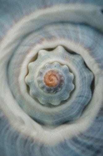
I came across this image on pinterest and love the baby blue and off white paired with burnt orange and darker hints running throughout the shell. It could be a fresh take on the blue-and-brown combinations we've been seeing a lot in interiors lately, with the burnt orange adding a subtle twist in place of the typical brown.
{Image sourced via Pinterest}
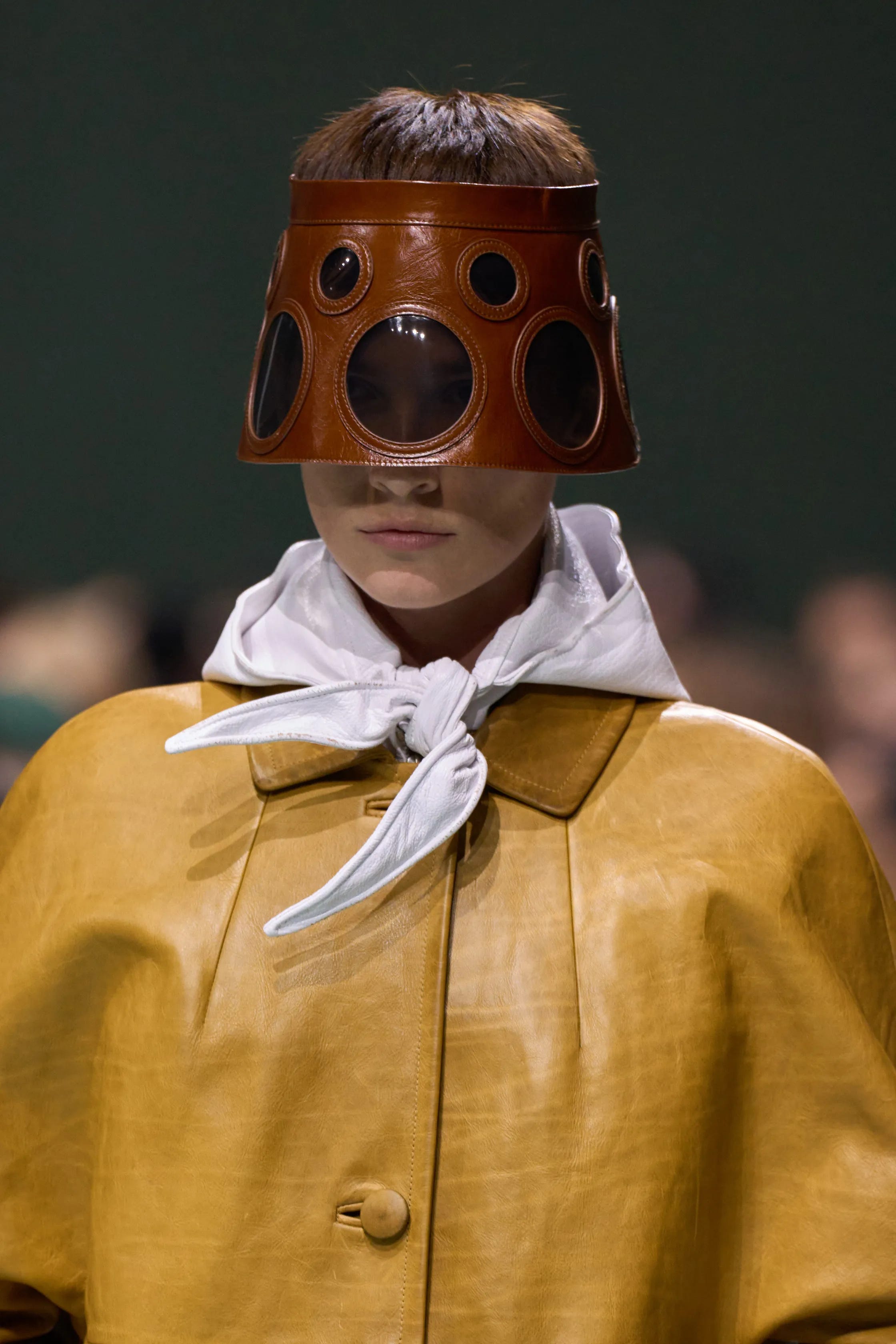
{Prada}: Yellow and Brown. Always Divine. Both feel like neutrals here and not that wild!? It’s a subtle pairing that doesn’t come across as too bold, but still manages to make a statement. The combination feel natural without being too daring.
{Image sourced via Prada}
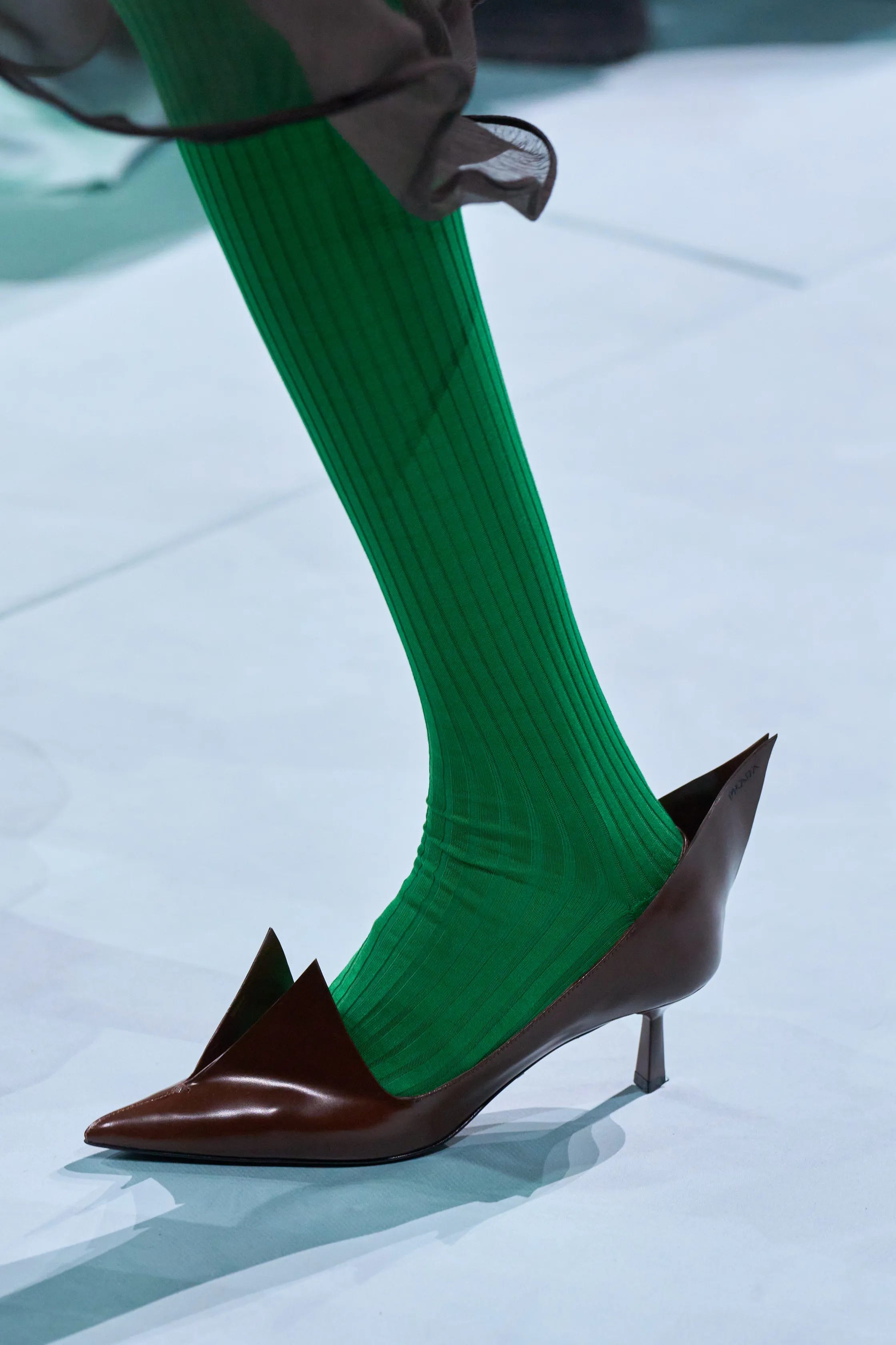
{Prada}: Green and brown—while not a groundbreaking combination, it's lovely nonetheless. In this case, the brown is a rich cocoa shade, perfectly complemented by a vibrant forest green.
{Image sourced via Prada}
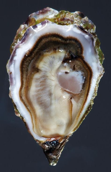
This shell is filled with such gorgeous colours: soft milky white, rich aubergine purple, earthy olive green, golden brown, warm cocoa, and a hint of fleshy pink. The tones complement each other beautifully, and it’s a reminder that nature consistently offers the most stunning and perfectly balanced colour combinations.
{Image sourced via Pinterest}
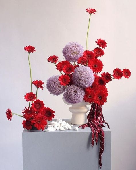
This isn't something I’d typically gravitate towards, but I absolutely loved the image of vibrant red blooms contrasted against the soft lavender flowers. The boldness of the red paired with the calming tones of lavender creates such a striking and unexpected balance.
{Image sourced via Pinterest}
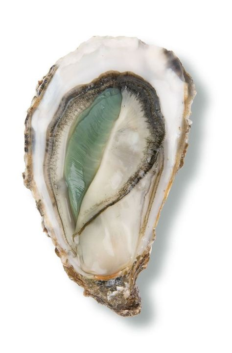
Here’s another shell with a completely distinct colour palette. I’m in love with the blend of silvery grey, pearly white, pale sea-foam green, warm beige and tan, earthy browns, and the soft touches of pink. These colours work perfectly together and are quite calming!
{Image sourced via Pinterest}
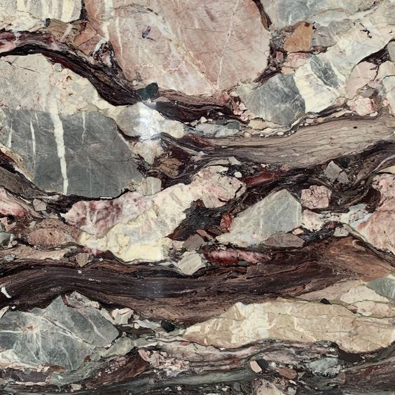
Natural stone is truly mesmerising with its incredible array of colours, making you question how it can be created naturally!! Here are some of my favourite colours all in one: pinky browns, deep reds, creamy hues, and subtle grey slate undertones.
{Image sourced via Pinterest}
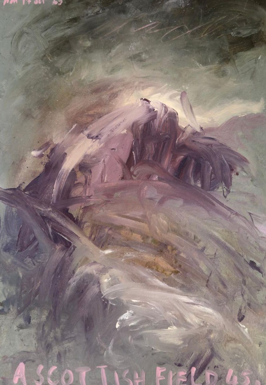
One of my favourite artists, Philip Maltman, excels at pairing colours beautifully, especially contrasting ones. This piece is stunning and I love the dark green contrasted with the various purple shades. Its a captivating combination!
{Image sourced via Philip Maltman}
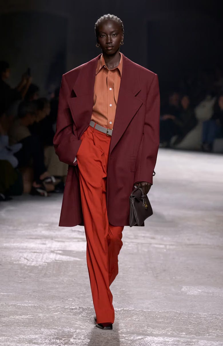
This is tonally epic by Bottega Veneta! The burgundy red paired with bold blood red, balanced by a muted orange and offset with a grey belt - it just works so well together!
{Image sourced via Bottega Veneta}


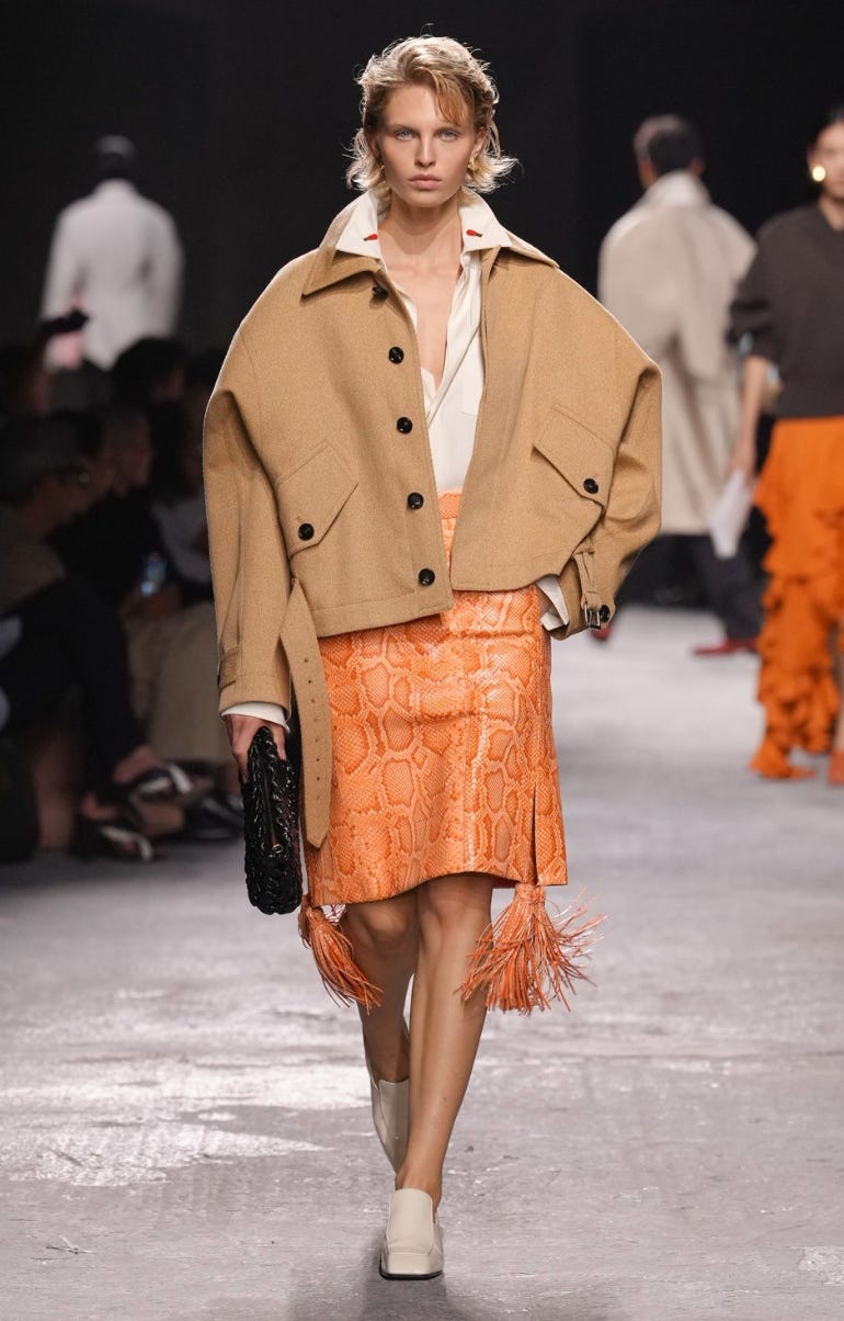
This outfit is understated yet still incredibly fun and playful, thanks to the pop of orange. The subtle hint of red on the collar of the white shirt adds an unexpected twist to the colour palette. The combination of tan, orange, and white creates a fresh scheme.
{Image sourced via Bottega Veneta}

There are so many more colour combinations to explore, and I’ll definitely keep an eye out for more unexpected ones! While not all of the pairs mentioned are groundbreaking, they’re all lovely in their own right. A simple pop of colour, whether through a throw, a decorative vase, or a bowl, can truly transform a room. It’s amazing how even the smallest touches (as shown above) can bring life and vibrancy to a space!
Have a lovely day!
Sincerely Loz x
Love your colour spotting here! I might actually borrow one or two ;) Happy Monday to you too!
/Sanna